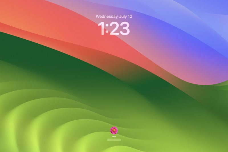
It looks uncannily like my Lock Screen.
The general trend of macOS releases over the past few years is that it has been moving closer and closer to the look and feel of iOS. The icons have become iOS icons, and their shape has become the iOS shape, and you can now use your iPhone as the Mac’s webcam, etc. etc. This occasionally comes at the expense of other functionality (ask me how I feel about the new Settings menu), but it is the direction that Apple has clearly been heading in since (arguably) Big Sur. Every so often, other splashy features are announced (Stage Manager, Universal Control, Quick Notes) that I write a lot about and then never end up using ever again.
So, good news for Continuity fans: that’s basically what’s going on with Sonoma. Ventura looked a heck of a…

