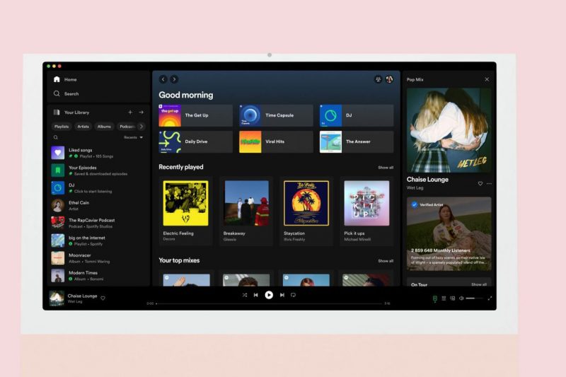
Spotify’s new desktop interface. | Image: Spotify
Spotify has officially announced a redesign for its desktop app that aims to offer easier access to details on the song or podcast you’re currently listening to, and give you new ways to organize your playlists and other content. According to a blog post published yesterday the changes — which Spotify calls “one of its biggest revamps yet” — are rolling out to “all Desktop users worldwide” from this week.
The biggest change you’re likely to notice after the update is the Your Library sidebar on the left of the screen. Rather than showing a simple text list of playlists, the interface now includes colorful icons. It also shows recently played artists and albums to quickly jump back into, alongside playlists. You can minimize the sidebar…

